
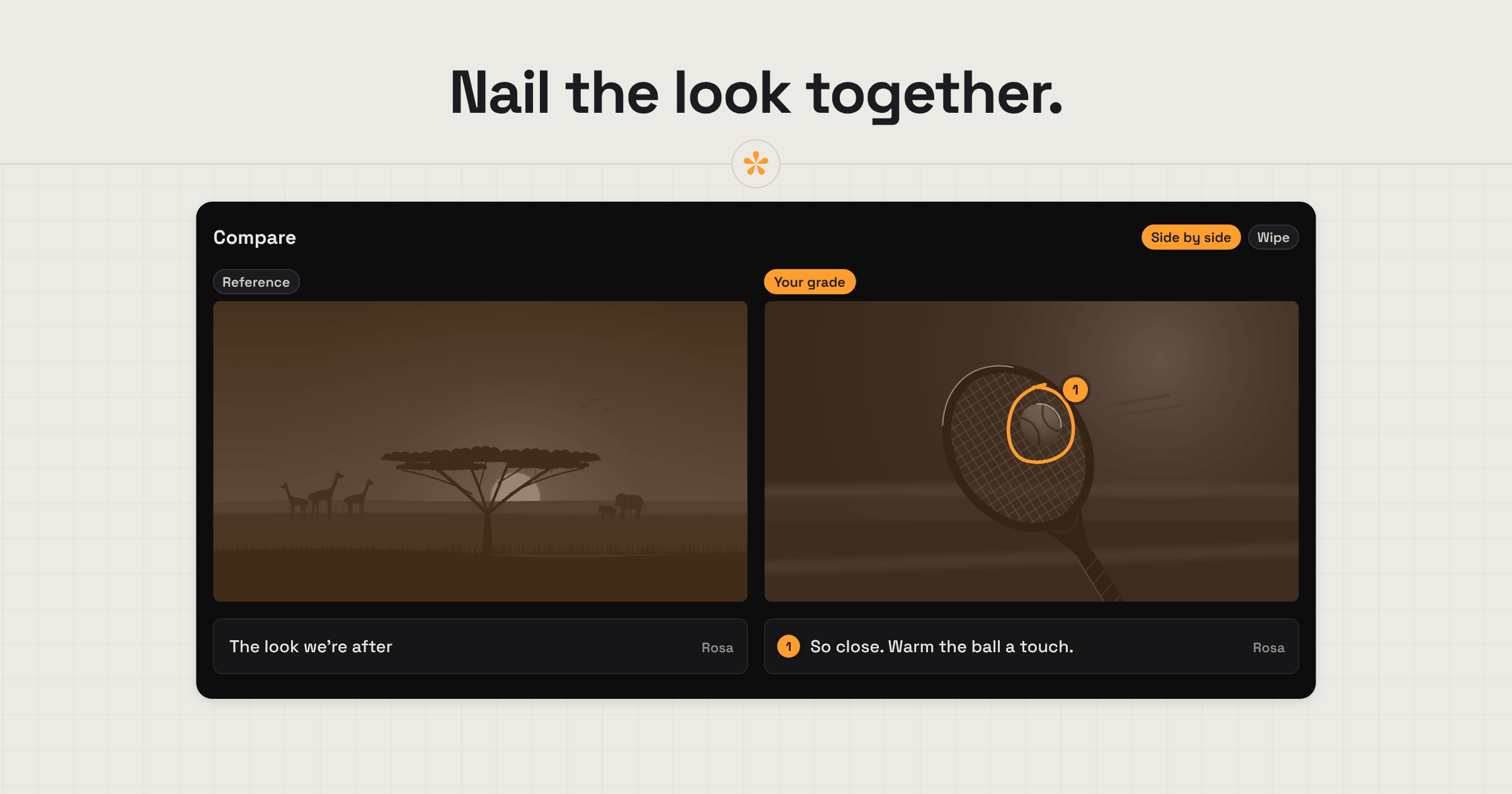
Colourists get clearer client feedback by agreeing on a look before grading the whole film. Start with a few reference stills, then compare frames from your grade against them to see what's working and what needs adjusting. In SceneNote, you can compare looks side by side or with a wipe, collect notes and drawings on exact areas, and review the graded cut with timestamped feedback until the client approves it.
The short version
- Gather reference stills before the first pass: ask the client for theirs, or upload your own as a starting point.
- Add them to an image set, where you and the client pin notes, mark areas and draw on each still, so you agree exactly what you like about the look.
- Grade, then put stills from your grade beside the references.
- Send the review link: the client compares your still and the reference side by side, and points out anything that's still off.
- Share the graded cut for notes on the exact frame and drawings on problem areas.
- Settle problem shots with a poll, and add each pass as a new version.
- The client approves the final grade.
ON THIS PAGE · 9 SECTIONS
How do references help a colourist decide a look?
References give a colourist and a client a shared picture of the look before anyone argues about words like “warm” or “moody”. You can use them in two ways: before the first pass, to decide the look, or after it, to fine-tune.
- Gather references before you start. Ask the client for stills from films they love, photos or a frame from an earlier project, or upload your own as a starting point when you want to suggest a look. Three or four is plenty.
- Keep them in one place. Add the stills to an image set in SceneNote, called something like “Grade references”, so they don't get lost in an email thread.
- Dissect each one together. Pin a note on the exact spot, drag an area or draw on the still: “love the skin tones here”, “not this green”, “this much contrast in the shadows”. Being that specific tells you far more than “something like this”.
- Or use them after the first pass. If the client can't find references up front, show your first pass and ask them to bring references for whatever doesn't feel right yet.
Where does colour grade feedback go wrong?
Colour grade feedback usually goes wrong for reasons that have little to do with the grade itself: vague words, a lack of direction, or references that never get used to their full potential.
The client's screen isn't calibrated
Most clients review on a laptop or phone that's nowhere near calibrated, with brightness, Night Shift or True Tone changing what they see. SceneNote can't fix the viewer's screen, so it's worth asking the client to turn those off and to check on their phone as well, since the grade can look quite different there. How to give feedback on colour grading is a page you can send them.
“Make it more cinematic”
Everyone means something different by it. Ask for a reference instead, or ask them to describe the change in relative terms: warmer or cooler, brighter or darker, more or less contrast, more or less saturation.
References sit outside the review
A still in an email or a shared folder is still useful, but you can't do much with it: nobody can draw on it, pin a note to the exact spot or set it beside your grade. References work far better inside the review itself, ideally as part of the same video project, so the cut, the stills and the notes all sit under one roof.
A look chosen by committee
Five people, five opinions on the same shot. Give them a poll with two or three options, and agree early who has the final say on the look.
How do you show a client how close you are to the reference?
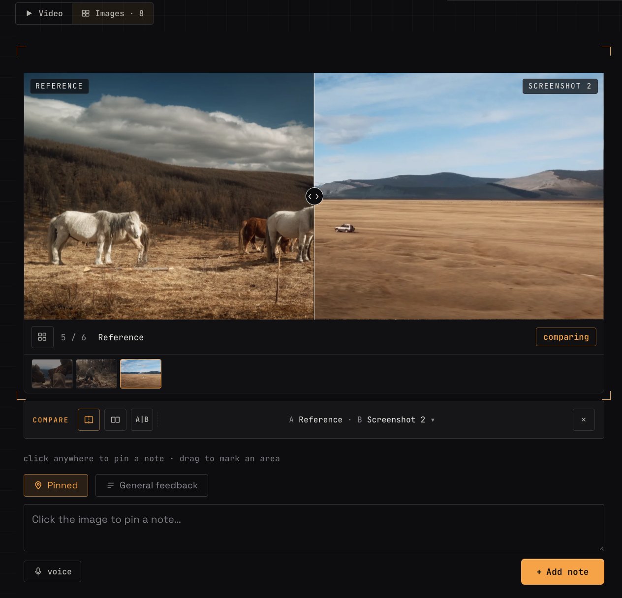
To show a client how close the grade is to a reference, put a still from your grade right beside the reference it's chasing. The client can then point at exactly what's still off.
- Export the matching frame from your grade in DaVinci Resolve or whatever you grade in.
- Add it next to the reference in the same image set.
- Send the link and ask what's still different. The client pins a note, drags an area or draws on the spot (“the sky is still too saturated here”).
- Adjust and repeat until the gap closes.
On Pro, stills can sit inside the video project itself, sorted into folders, and you can compare a reference and your still, or two uploaded grades, side by side or with a wipe, much like a split screen in DaVinci Resolve.
What does a typical grade review look like?
A typical grade review in SceneNote works like any other review once the look is agreed. The grade is usually the last pass, after picture lock and the sound mix.
- Upload the graded cut and send the review link.
- The client watches it through once without stopping, to judge the overall feel.
- Notes on the exact frame. Timestamped notes for a single shot, range notes for a whole scene and drawings on problem areas.
- Polls on problem shots. If a shot could go two ways, show both and let the client pick.
- Work through the notes. Every note sits in one list in the review room. If you'd like them in DaVinci Resolve, export them as markers: open notes come in yellow and resolved ones in green.
- Add each pass as a version on the same link, so the client never wonders which grade they're looking at, and compare two passes side by side or with a wipe.
- Approval. When the grade is right, the client presses Approve, and their name and the date are recorded.
What should a colourist look out for before sending a grade?
These are the things clients tend to spot, so they're worth checking before the link goes out.
- Shot matching. A shot needs to match its neighbours to feel cohesive, because footage comes from different locations, lighting and cameras. It usually shows in small things: exposure or contrast, saturation, or one hue, like the sky or the leaves, more saturated than in the next clip.
- Skin tones. Keep them within a natural range, and check them on a phone as well as your grading monitor.
- Artefacts and banding, especially on 8-bit footage pushed hard.
- Noise, in the shadows and in lifted footage.
- Unbalanced footage and white balance that doesn't sit with the rest of the scene.
- Over-grading. A look that's fighting the footage rather than helping it.
- Shots that won't match. Sometimes the honest answer is to swap the shot, and it's better to raise that with the editor early.
What does this look like on a real project?

I usually start with references from other films that suit the brief and run them past the client. That narrows it down. Then I grade a couple of shots from the actual film a few different ways, narrow it down again, and only once they're happy with a look do I grade the rest.
I'll often point clients to Compare in SceneNote, so they can put the looks side by side and work out exactly which one they like.
There's not much you can do about a client's screen. It depends where the film is going: Netflix has its specs, YouTube has its own, and people will watch it on thousands of different screens. But when you're making decisions, compare apples with apples. Check what they're watching on, ask them to use a similar screen, or share your screen straight from Resolve so you know they're seeing what you see.
A shot that won't match its neighbours? If it's distracting enough to pull the viewer out, replace it or cut it. If it's brief and the story needs it, sometimes you just live with it. Go with whatever adds the most to the film.
When a client wants to scrutinise every detail, I tell them to use the download button and get the exact file I exported. They can check it on their own screens and still leave their notes in SceneNote.
Which SceneNote feature fits which moment in a grade review?
Colourists reach for a handful of SceneNote features again and again.
| The moment | The feature | Why it fits |
|---|---|---|
| Agreeing the look | Image set of references | Every reference in one place, with notes on the exact spot |
| Showing how close you are | Your still beside the reference | The client points at what's still off |
| A note about one shot | Timestamped note | Pinned to the exact frame |
| A note about a whole scene | Range note | Covers a start and an end |
| “This bit of the sky” | Drawing, or an area on a still | Marks the exact spot |
| Two possible looks for a shot | Poll | The client picks, and the decision is on record |
| Each pass of the grade | + version | Same link, and each pass keeps its own notes |
| Working through notes in Resolve | Markers export (optional) | Open notes yellow, resolved notes green |
| Comparing two looks or two passes | Compare, side by side or with a wipe | Much like a split screen in DaVinci Resolve |
| The grade is finished | Approve | A dated record of who signed off |
Which guides help colourists most?
- How to compare colour grades with a client
- How to give feedback on colour grading (the client's side, worth sending to them)
- How to send images alongside a video
- How to get client notes into your editing software
FAQ
Can I get grade notes into DaVinci Resolve?
Yes. Export the notes as markers in an .edl file and import them onto your Resolve timeline. Open notes come in yellow and resolved notes in green, each at its own timecode.
Do clients need an account to review a grade?
No. Clients type their name the first time they leave a note. There's no account, invite or app.
Will the client see the grade exactly as I do?
Not unless they're watching on exactly the same screen as you, set up the same way, and that's rare. Ask them to turn off Night Shift and True Tone, set their brightness sensibly and check on a phone too, and judge notes about overall warmth or brightness with that in mind.
What's the simplest way to get client feedback on a colour grade?
Agree the look from references before the first pass, show your graded stills beside them, then review the graded cut with notes and drawings on the exact frame, and add each pass as a version until the client approves.
References, stills and the grade in one place.
Compare looks, leave notes on exact areas and agree on the final grade together.
Related guides
Bryn North
Filmmaker and creative director · part of the team behind SceneNote
Bryn North is a filmmaker and creative director who has been making films since 2013, mostly documentaries and travel films, with a soft spot for stories about cultural heritage. He has directed, shot and edited launch films for DJI, worked with brands like Audi and Samsung and with a number of tourism boards, and some of his personal travel films have had millions of views. Working with a new client almost every month, he found that most of the job was communication, and that every client gave feedback differently. SceneNote is his answer: one simple way for clients to leave detailed notes and talk them through.
More guides by Bryn →