
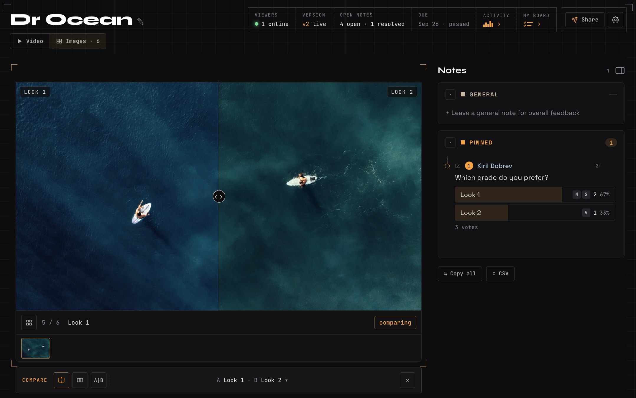
To compare colour grades with a client, show the same frames in two or three different looks, then ask which feels closest to what they're after. Encourage specific feedback on areas like skin tones, shadows or the sky. In SceneNote, you can share the graded stills in an image set, collect notes on exact areas and use a poll to agree on a look before grading the full cut.
The short version
- Export the same frame, or set of frames, from each look.
- Name each still clearly, like “Look A: warm”.
- Add them to an image set.
- Add a poll asking which look they prefer.
- Send the link with a short brief.
- Grade the cut in the chosen look, and share it as a new version.
ON THIS PAGE · 7 SECTIONS
Why compare grades on stills before the full video?
Comparing grades on stills first makes the choice simpler. The client looks at one frame at a time, in every look, without the cut moving on before they've made up their mind.
- The same frame in every look. Nothing changes between the options except the grade, so the difference is easy to see.
- Faster decisions. A client can pick between two stills in a minute. Choosing between two full grades of a film takes much longer.
- Notes on the exact spot. A pin on the sky or a drawing round a face says more than “a bit less orange”.
References help here too. If the client has a film or a photo in mind, ask them to share it before you grade, since a reference says more than words like “moody” or “cinematic”.
How do you set up a grade comparison, step by step?
To set up a grade comparison, export matching stills from each look and put them in a SceneNote image set with a poll.
- Pick the frames that show the look. A face, a wide shot or a hero shot. Use the same frames for every look.
- Export one still per look. If you want to show several shots, lay them out together on one still for each look, so the client compares like with like.
- Name each still clearly, like “Look A: warm” and “Look B: natural”. The name shows next to every note, so nobody mixes them up.
- Add the stills to an image set. The client can pin a note, drag an area or draw on any part of the picture.
- Add a poll: “Which look is closest to what you have in mind?”, with one answer per look.
- Send the link with a short brief (below).
What should you ask the client to look at?
Ask the client to look at the overall feel first, then the details that matter most to them. Send a short brief with the link, something like this:
Here are two looks for the film, on the same frames.
1. Vote for the look closest to what you have in mind. 2. Pin a note on anything you'd change: skin tones, a particular colour, the shadows or the highlights. 3. If you like something in both, say so on each one. 4. Please look on the screen you'll mostly watch on, with Night Shift and True Tone switched off if you're on an Apple device.
A few things are worth checking yourself before you send it:
- Skin tones sit within a natural range, unless the style is deliberately pushed.
- The look matches the references you agreed on, if you agreed any.
- The product or brand colour matches the real thing.
- No artefacts or banding, especially in skies and smooth gradients.
- Check on a phone too, since that's often where the client, and the audience, will see it.
How do you show the difference on the moving picture?
Once the client has chosen a look, grade the cut and share it on the same link as a new version, so they can check the look holds up in motion. On Pro, you can also wipe or play side by side between two uploaded versions, or between stills in an image set.
What does this look like on a real project?

I love using image sets as part of my colour grading process. Grading is very subjective: what you like and what the client likes can be two very different things, so agreeing on a look early on is super important.
References of other grades really help us pin down the look we're going for. Sometimes the client likes parts of both, and being able to point at things on the images helps with that. Then I can create a custom look based on all of that input.
I might take it a step further and make two variations of that look on the same still, and let the client pick between them. It's really about getting on the same page as your client. Grading is a very visual part of the process, so they need to see what you're seeing.
How to handle common problems
The client's screen is too bright or too warm
Most clients review on a screen that's likely not colour calibrated, so a look can seem warmer, brighter or more saturated than it is. Ask them to switch off Night Shift and True Tone and set a sensible brightness. How to give feedback on colour grading is a page you can send them.
They like parts of both looks
That's useful, not a problem. Ask them to pin what they like on each still (“love the skin here”, “prefer the sky on Look B”), then make a third look that combines them and add it to the set.
They judge it on a phone
If the audience will mostly watch on phones, that's a fair test. Ask them to look on a computer as well if they can, and check both yourself, so you know whether a note is about the grade or the screen.
FAQ
How many looks should I offer?
Two or three. More than that makes the choice harder, not easier.
Should clients compare stills or the full video?
Stills first, to choose the look. Then the graded cut, to check it holds up in motion and across every shot.
Do clients need an account to vote or leave notes?
No. They type their name the first time they vote or leave a note, and that's all.
What's the simplest way to compare colour grades with a client?
Export the same frames from each look, name them clearly, put them in an image set with a poll, and ask the client to vote and pin notes on the exact spot. Then grade the cut in the chosen look and share it as a new version.
Show the looks, let the client choose.
Compare colour grades side by side, leave notes on exact areas and agree on the final look together.
Related guides
Kiril Dobrev
Filmmaker · part of the team behind SceneNote
Kiril Dobrev is a filmmaker with 15 years of experience and a passion for documentary and travel. He’s spent a lot of that time in the editing room, obsessing over how to make his workflow better, and the feedback loop has always been a big part of that. Post-production still hasn’t had a good enough answer to it. SceneNote was born from that, with one simple idea: make feedback better.
More guides by Kiril →