
To give useful feedback on colour grading, pause at the exact moment and point out what looks wrong. Describe the change in plain language: “Her skin looks a little orange at 0:45. Could it look more natural?” is much more helpful than “the colour feels off”. If you have a particular look in mind, share a reference image to show the editor what you're after.
The short version
- Check your screen first: brightness up, night modes off.
- Watch the graded video at the highest quality you can.
- Pause where something looks wrong and draw around the area.
- Describe the change relative to what you see: warmer, cooler, brighter, darker.
- Paste a link to a film, video or photo with the look you want.
- Check it on your phone too, since that's where many people will watch.
ON THIS PAGE · 7 SECTIONS
Which words help a colourist?
The most useful colour notes describe what you see compared with something else: the shot before, the product, a reference. Most screens aren't calibrated, so “warmer than the last shot” travels better than “too orange”.
| What you see | Useful words | Example note |
|---|---|---|
| The picture feels cold or warm | Warmer or cooler | “Feels a bit cold for a summer wedding. Could it be warmer?” |
| It's hard to see detail | Brighter or darker | “Her face is hard to see here. Could it be brighter?” |
| It looks flat, or too harsh | More or less contrast | “Looks a little flat. More contrast?” |
| Colours are too strong or too dull | More or less saturation | “The greens feel too strong in this shot.” |
| Skin looks wrong | Skin tones, more natural | “His skin looks red compared with the shot before.” |
| A colour doesn't match your brand | Match the product or packaging | “The bottle looks more yellow than our real packaging.” |
| Shots don't match each other | Consistent, match the shots around it | “This shot is darker than the others in the scene.” |
| You want a style | A look reference | “Could it feel more like this? [link]” |
Skin tones have a natural range with room for style, but they shouldn't look unnatural unless the whole video is deliberately stylised. If someone looks ill, sunburnt or grey, say so.
Why do references matter so much in colour feedback?
A reference says more than any description, because colour words mean different things to different people. “Cinematic” might mean dark and moody to you and golden and warm to the colourist, and even “warm” and “cool” are relative: warmer than what? Show them instead.
- Find a film, video, ad or photo with the look you're after.
- Paste the link into a note at the moment it applies, or into General feedback for the whole video. On a SceneNote review link it shows as a small chip that opens in a new tab.
- Say what you like about it and what you don't: “I love the warm highlights, but not how dark the shadows are.”
If the colourist has shared graded stills alongside the video, comment on each one in the same way: pin a note on the spot, drag a box round an area, or draw on it.
Is your screen showing the real colours?
Probably not exactly, and that's fine as long as you know it. No two screens show colour the same way, so colourists aim for the best average across the devices people will actually use. A few checks make your notes more reliable.
- Turn the brightness up, and switch off automatic brightness while you review.
- Turn off night modes such as Night Shift, True Tone or Night Light, which warm the picture.
- Watch at the highest quality you can. On an uploaded video, choose the top setting in the player's Quality menu; on YouTube, use YouTube's own quality setting.
- Check on your phone too. Colour can look quite different there, and it's where many people will watch.
- Describe changes relative to what you see, like “warmer than the shot before”, rather than as absolutes.
If you have a MacBook to hand, it's a useful extra check. Its screen isn't perfect (for that you'd need a colour-calibrated monitor, a fairly niche piece of kit), but MacBooks are common and do a pretty good job of showing colour accurately.
How do you mark the exact area?
To point a colourist at one part of the picture, pause the video and draw on the frame. On a SceneNote review link, choose Draw, circle the area (a face, the sky, a product), then say what you'd change in the note.
A reference works here too. If a shot in another video has the look you want, paste the link into your note, say why you like that shot, and that you'd like this one to feel like it.
On graded stills, you can also click to pin a note on a single spot, or drag to mark an area with a box. Either way, the colourist sees exactly which part of the picture you mean.
How do you choose between two looks?
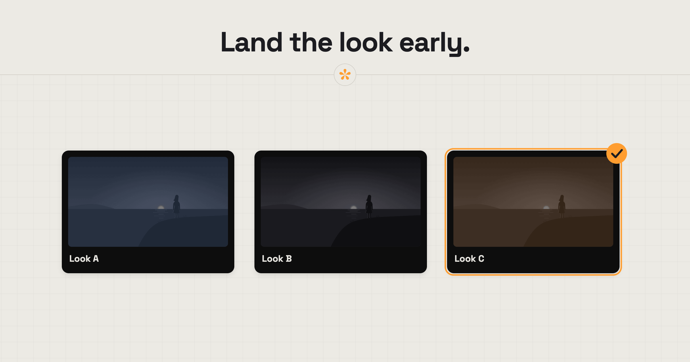
If the colourist offers two or three looks, they may ask you to pick with a poll: click the look you prefer, and reply under the poll if you like parts of each. If they've set up a comparison on uploaded versions, open Compare versions from the player's ••• menu to see the two grades side by side or with a wipe you can drag across the picture. Compare works on a computer rather than a phone.
Whatever the method, spend time with your colourist or editor really landing on the look, and do it early. It may take a couple of passes. Often it starts with two or three looks, and you build a hybrid by saying what you like about each; then the colourist shows you what they've done and you tweak it from there. Settling on a hero shot, one shot the colourist uses as the reference for grading everything else, matters a lot: without it, there's nothing to aim for. Switching to a completely different look when the grade is half done, or worse, finished, is very costly in time, for you and especially for the editor.
Colourists and editors set this up from their side, as covered in how to compare colour grades with a client.
What does this look like on a real project?

The look depends on the project and where people will watch it. A commercial might want a very clean look; something more emotional can be graded more like film.
I never grade the whole thing first. I take a few shots from key moments, grade them in a few different styles and let the client pick. We might go back and forth a few times, and only once they're happy with a look do I grade the rest.
Clients don't speak colour grading, and they shouldn't have to. Drawn notes are a win: circling the forehead that's too bright, or the leaves on one bush that are overexposed, saves typing a paragraph. A reference link helps too, and so does talking it through in the replies, so nothing changes until we agree on exactly what needs to change.
Products and brand colours are the exception to all that creative freedom. They have to match real life exactly. I don't touch the client's brand assets, and for any product we've filmed I start from a reference and make it look true to life.
Then there are screens. Every screen shows colour a bit differently: more or less contrast, saturation, brightness. Ideally whoever's reviewing sees it on the same kind of screen you graded on. Otherwise you go back and forth about two different colours and never see eye to eye.
FAQ
What does a colourist need from me?
The exact moment, what you'd change in plain words, and ideally a reference. “Warmer, like this [link]” at the right timecode is a near-perfect colour note.
Should I judge colour on my phone?
Check on your phone, because many people will watch there, but don't rely on it alone. Look on a laptop or monitor with night modes off as well, and mention which screen you used.
Why does the grade look different on my screen?
Every screen shows colour slightly differently, and settings like Night Shift or True Tone warm the picture. Describe changes relative to what you see, and the colourist will weigh them up.
Why does the rough cut look so grey?
The colour grade usually comes last, so earlier cuts often look flat because they were shot in Log, a flat camera setting that keeps as much detail as possible for the grade. Save colour notes for the graded version unless the editor asks for them.
What's the simplest way to give feedback on colour grading?
Check your screen, pause where something looks wrong and draw around it. Describe the change in relative words (warmer, brighter, more natural) and paste a reference of the look you want.
Show the look you're after.
Point to what you'd change, describe it in your own words and share a reference.
Related guides
Bryn North
Filmmaker and creative director · part of the team behind SceneNote
Bryn North is a filmmaker and creative director who has been making films since 2013, mostly documentaries and travel films, with a soft spot for stories about cultural heritage. He has directed, shot and edited launch films for DJI, worked with brands like Audi and Samsung and with a number of tourism boards, and some of his personal travel films have had millions of views. Working with a new client almost every month, he found that most of the job was communication, and that every client gave feedback differently. SceneNote is his answer: one simple way for clients to leave detailed notes and talk them through.
More guides by Bryn →